Brand Guidelines
Version
1.2
Updated
9 July, 2025
Brand Guidelines
Version
1.2
Updated
9 July, 2025
06
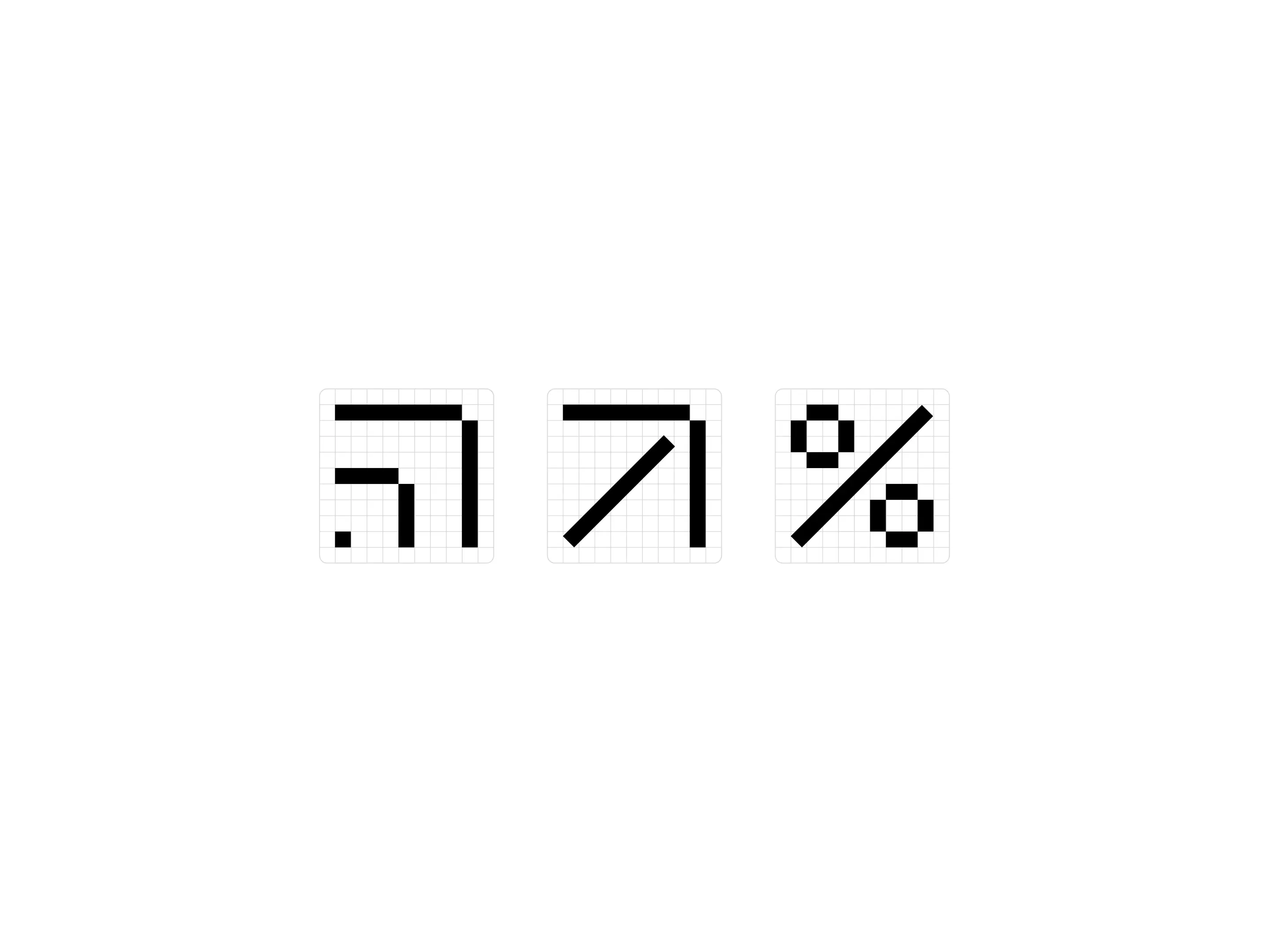
Iconography

Icons are built from a shared grid and design logic. Using blocky, straight-edged forms, they echo the visual structure of the logotype. Icons are minimal, legible, and designed for both UI and brand use with consistent spacing and alignment.
Icon Use
Maintain consistent spacing and scale. Icons should align visually with accompanying typography line-height, with optical balance prioritized.
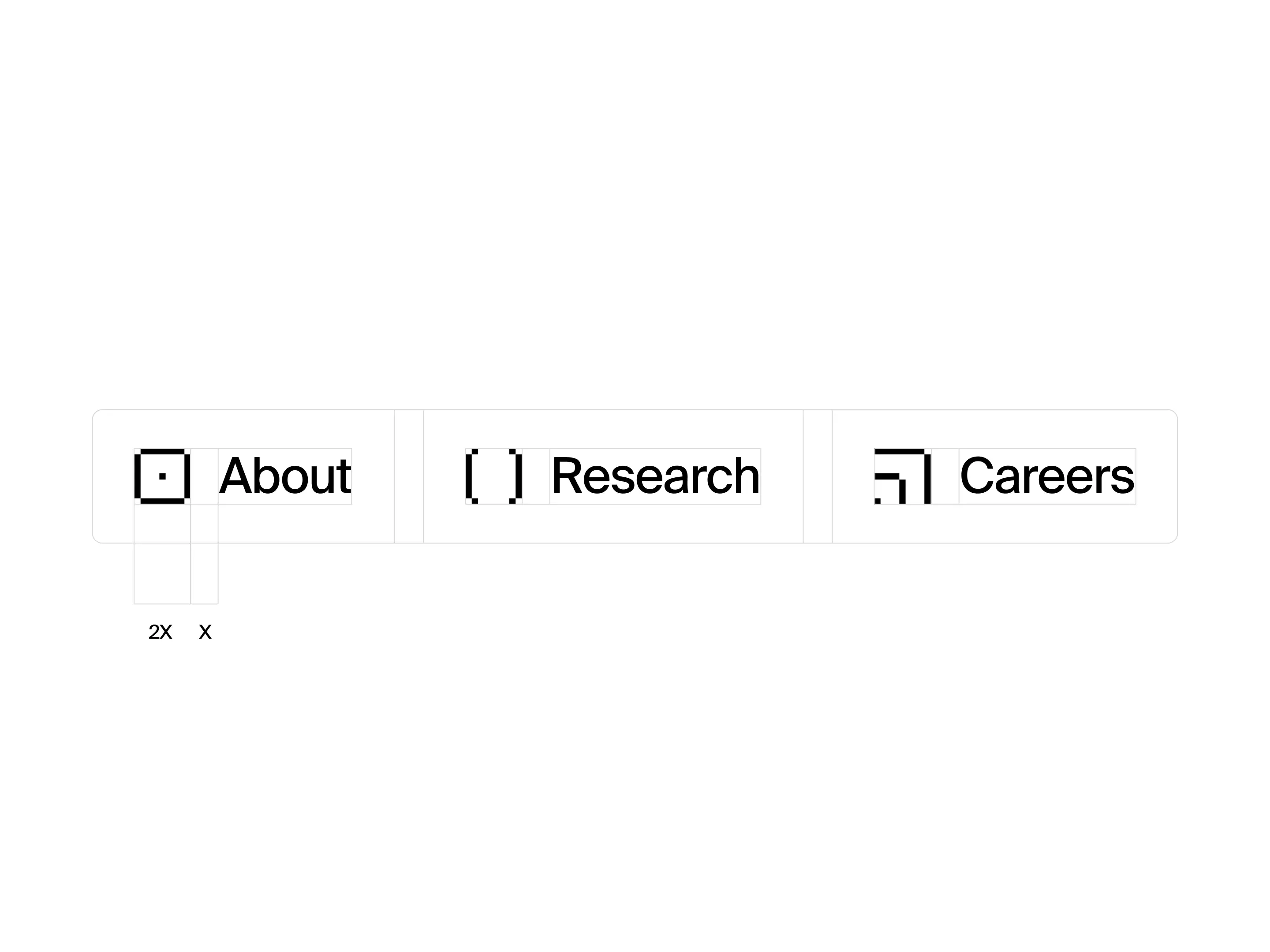
Custom Icon Library
Each icon is designed using a strict grid and blocky, pixel-informed geometry—reflecting the typographic tone of the logo and the underlying logic of the system.

Icon Creation
Inspired by dither language, each icon is formed using modular elements and sharp edges. The result: clarity, structure, and brand consistency at micro-scale.
© 2025 a37 Inc.
03
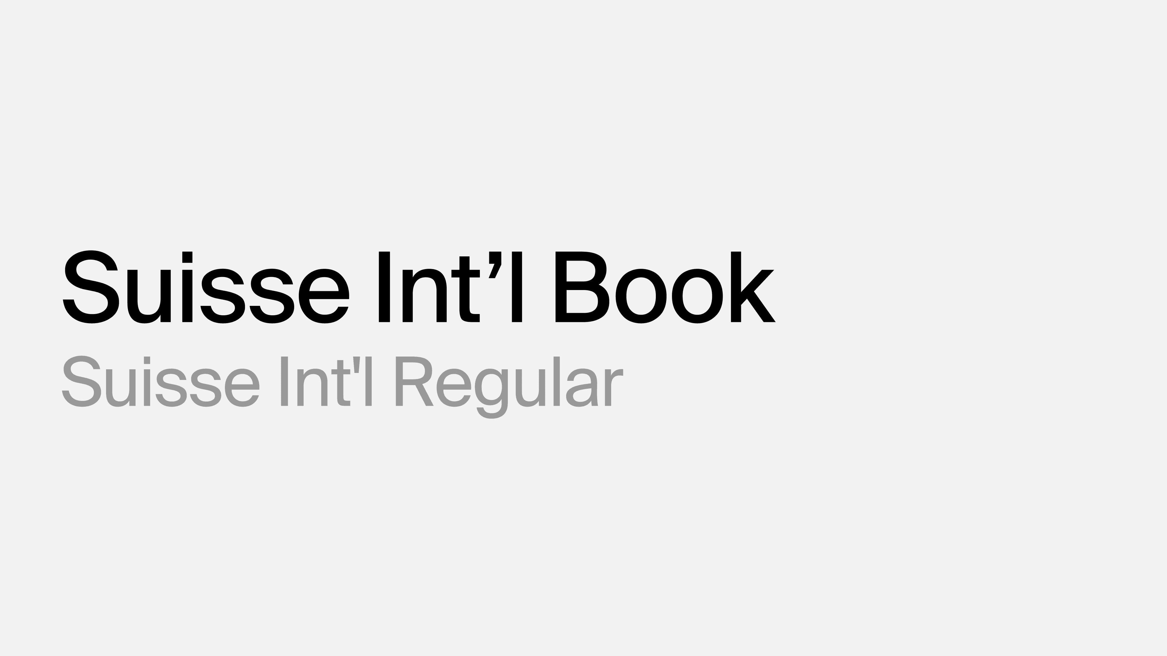
Typography
We use Suisse Int’l to reinforce the brand’s core values of precision, neutrality, and intelligent design. Its geometric clarity and versatile weight range reflect a37’s commitment to reliable structure and human readability.
Logo Typeface
Suisse Int'l Book
Headlines
Suisse Int'l
Book
Line Height
120% / 1.2em
Letter Spacing
—2.0% / —0.02em
Creating the first AI agents capable of reasoning across entire enterprise DevOps stacks
Body Copy
Suisse Int'l
Regular
Line Height
130% / 1.3em
Letter Spacing
—2.0% / —0.02em
a37 is addressing this by creating the first AI agents capable of reasoning across entire enterprise DevOps stacks. These agents power Forge, an AI-native DevOps workspace that transforms how teams manage infrastructure at scale.
a37.ai
© 2025 a37 Inc.